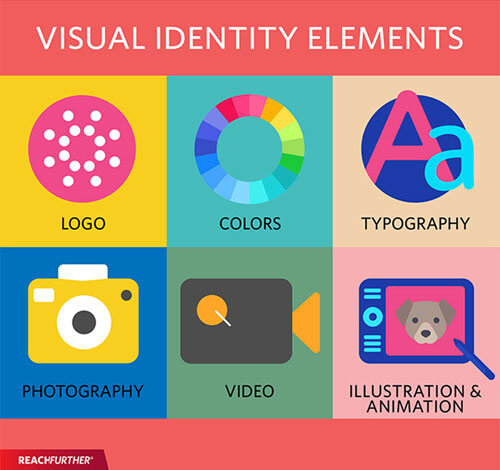
When we say a cohesive visual identity, we mean all of the imagery that reflects your brand. This is also sometimes called a brand identity or a corporate identity. It’s one of the first things you need to think about when launching a new business because your visual identity is the first thing prospective customers will notice and associate with you.
Once you decide on a business idea, formally register your business, and take care of business formation expenses, you’ll need to start creating strategies that will aid your future audience in recognizing your business through cohesive branding. Having cohesive and consistent branding from the start will allow you to build long-lasting relationships with customers.
But why is a visual identity so important for digital marketing? And how can you create a cohesive visual identity across all platforms? That’s what we will focus on in this informative guide.
Why is a Visual Identity Important for Digital Marketing?
The main reason a visual identity is so important is it inspires trust and loyalty in your audience. If someone sees you visually represented on a landing page and then clicks through to your webpage only to find a completely different color scheme and tone, it can be jarring and lead to abandonment.
Creating a cohesive visual identity around your brand is also considered part of your brand assets. This adds value to your business should you sell the company in the future or bring on investors.
A cohesive visual identity creates a sense of safety and familiarity among customers. It’s something they can rely on and will create a sense of loyalty through familiarity. You’ll be able to see this reflected in your ETL analytics over time.
Your visual identity represents who you are as a business, so it must be carefully thought out, carefully laid out, and cohesive across various platforms, including your social media pages, website, landing pages, ads, print materials, signage, and more.
How to Create a Cohesive Visual Identity for Digital Marketing
Take Your Target Audience Into Account:
Before deciding on how to create your visual identity, you have to consider your target audience. Just because you have a personal vision for your brand doesn’t mean that it’s something your audience is going to appreciate or gravitate toward.
That’s why you must understand who your target audience is. Create customer profiles detailing vital demographic information. If you’re serving a broad demo, create many different customer profiles, listing specific information about each segment and how you’ll market to them.
Also, remember to check digital marketing trends to get more clues about your customer avatar. After all, the more information you obtain about them. The better.
Just a few of the factors you should take into account include your audience’s:
- Age
- Geographic location
- Gender
- Marital status
- Pain points
- Interests
- Income
- Occupation
- Communication preferences
By understanding all of this, you’ll be able to design a visual identity that appeals to the sensibilities of your audience, crafting something that resonates with their hearts and minds and pulls them in.
Create a Logo
Your logo says a lot about your company. It’s the first thing that comes to mind when someone thinks about your organization, and it should complement the rest of your visual identity.
Think about some of the most recognizable logos on the planet. There’s the McDonald’s arches, the Nike swoosh, the Coca-Cola logo, and so on. These are instantly recognizable logos that have gone mostly unchanged through the years. They’re dependable and significant in the minds of the target audience.
When you see the golden arches of McDonald’s, you instantly start to think about the restaurant chain and its food. If you see the Coca-Cola logo, you might start to notice that you’re thirsty.
A logo can invoke a lot of emotion, but it should always be a symbol of quality overall.
Stick to a Specific Font
The font you associate with your business can tell much about who you are and what you do. For example, something like Times New Roman is more authoritative and professional, whereas Comic Sans could evoke feelings of a more light-hearted younger organization.
Fonts are also important in your logo. Take the Disney company logo, for instance. It uses a very specific and instantly recognizable font based on Walt Disney’s personal signature.
Choose a font that appeals to your target audience and reflects the tone you’re trying to convey through your copy. This font can then be used on your website, landing pages, and any promotional ads you might be running. If you pick something unique enough, it might even become a signature for your brand.
Choose a Color Scheme and Be Consistent
The colors you choose can be used to evoke specific emotions in your target audience. For example, if you’re creating a line of pain relievers, then soothing blues and whites might be a good idea.
Additionally, if you’re developing an intense, high-energy workout plan, then explosive reds, oranges, and yellows might help you reach your audience with the intended emotional response. The visuals you choose for your brand must bring about the same emotions and associations you want your product to evoke. For example, HIMS, which actively sells ED meds online, uses mostly cool colors and light tones for its website visuals. This creates an immediate association with cleanliness and peace of mind.
Whatever you decide to do, you must keep it consistent across various platforms. That means the color schemes used in your ads should be reflected on the landing pages they point to. The colors there should match those on your social media imagery and website. You’re trying to create a cohesive and seamless experience across various platforms, and colors go a long way toward that goal.
Choosing a consistent color palette that’s aligned with your logo and imagery is fundamental. Start by selecting the color that best represents your brand.
Take CalAmp as an example, a company that specializes in telematics software and supply chain visibility. It chose blue as its principal color and uses it across all of its digital platforms and marketing strategies harmoniously. This is evident in the image above.
Develop a Brand Tone
The tone of voice that you write in also plays a significant role in establishing your brand’s visual identity. That tone of voice can speak volumes about what kind of company you are.
Are you more laid back and casual, or do you take a serious and academic tone to convey your authority and knowledge on a subject?
This tone should be reflected across all channels, but it’s especially vital for your email marketing campaigns.
Your visual identity should be transferred to the content carried within your email campaigns. This includes the color palette as well as the text and fonts. Your images should also take the visual identity and tone into account. It’s even important when writing your email subject lines.
The tone of voice you communicate in must follow your desired visual identity. For example, you can’t have light, fun images of young people playing volleyball on a beach and pair them up with a super academic tone. The dissonance is noticeable and jarring. It could be the factor that pushes someone away from your business.
Choose a Theme and Stick to it
When choosing the art and illustrations you’ll roll out, ensure they adhere to a general theme.
For example, let’s say you’re developing a series of infographics designed to spread the word about your products and how they impact customer pain points. The imagery used in these graphics should all look like they came from the same place. That means the same photography style, the same art style, all laid out in similar ways.
Eventually, this art theme or style will become synonymous with your brand, and customers will only have to glance at the images to know where they came from. The familiarity becomes comforting for them, like greeting an old friend after having not seen them for some time.
Conclusion
Your visual identity is vital to your brand’s success. Ensure that you lay out every aspect of this identity in a style guide that can be distributed to all employees. Consistency is key, and any slip-ups could be disastrous.
To review, when creating a cohesive visual identity that compliments your digital marketing strategy, make sure that you:
- Develop the identity with the preferences of your target audience in mind
- Create a logo that appeals to your audience and can become synonymous with your brand
- Stick to a specific font that compliments your imagery and tone
- Choose a color scheme and stick with it across various platforms
- Develop a consistent brand tone
- Choose a theme for the images and artwork you share and stick with it
By following these six tips, you’ll be able to carve out a consistent and reliable visual identity that will appeal to your audience and keep them coming back for years to come.
About the author
Shane Barker

Shane Barker is a digital marketing consultant who specializes in influencer marketing, content marketing, and SEO. He is also the co-founder and CEO of Content Solutions, a digital marketing agency. He has consulted with Fortune 500 companies, influencers with digital products, and a number of A-List celebrities.
