
Visual branding on Instagram is an excellent way for marketers to make shareable, relatable content. With all the changes on Instagram and how everything keeps feeling new, many marketers forget that the fonts that Instagram keeps introducing for stories actually make a difference in how content is perceived by target audiences. Conventionally, Instagram had only a few fonts (traditional ones). Now, however, there are several more that make the content appealing to viewers of all ages.

Content marketers and digital creators constantly need to upgrade their skill sets to attract attention to the content, make it relatable, shareable, visually beautiful and drive the brand voice and tone. Instagram fonts are an excellent way to immediately grab the audience’s attention to the post, reel, or story.
Before we look further into the details of how Instagram fonts can drive higher traffic and engagement, it is crucial to consider the best ways to make content shareable.
What Makes A Shareable Social Media Image?
Most marketers critically analyze competitor Instagram accounts and follow their trending posts carefully. Ever wondered why the best marketers in the world think it’s necessary to look at other posts? It is because the ways to make social media images shareable and likeable keep changing and evolving. Experienced marketers always look for ways to develop and improve their skills. One of the best ways to do this is to keep a watchful eye on everything that is trending.
Many novices make the mistake of thinking shareable social media images differ only based on colour schemes and pictures. Visual content appeals to audiences wholly based on subtle cues – even faster than text, audio, and video. Photographs and images optimized with original content, excellent colour schemes, and naturally engaging text appeal more to audiences than black and white images, devoid of any fonts and texts.
Marketers that research their target audiences, have demographic information, and can visualize how the audience needs to react create excellent shareable images with the help of digital creators. Let us look at what makes a shareable social media image.
8 Main Explanations That Make A Social Media Image Shareable
1. Emotion and Design
Emotion is needed to make the content epic. Epic content is the type that adds immense value (emotional value) to the viewers. Marketers that use social media like Instagram, Facebook, and Twitter to post emotionally valuable content see higher conversion rates, clicks, shares, and more.
Shareable images should:
- Have credible quotes
- Add depth with text and imagery
- Back up data, facts, and figures
- Show statistics that matter to target audiences
- Have colours that attract
- Excellent legible font typefaces
- Add complexity with research
- Show one out of these five emotions – serenity, admiration, amazement, interest, or astonishment
Design is critical in creating an impact. It needs to be a mix of hard-hitting facts, colours, emotions, images, and simplicity. Images and logos that marketers use straightforwardly hold more appeal to viewers than complex ones. For example, when smokers were presented with highly graphic designs about the harms of smoking, they tended to ignore the images and smoke more.
Quick design tips for marketers:
- Clarity – messages, calls to action, highlights should be easy to see
- White Space – leaving empty spaces can actually be more beneficial than filing everything with colour, text, or design accents.
- Use Templates – using templates help keep the uniformity (as you will see ahead)
2. Give The Audience The Solutions They Need
Experienced marketers are excellent at finding solutions to issues and problems that audiences may have. This does not mean that the content needs to be solution-driven all the time. It just means that creating images, infographics, and other visual content that has a need resolved or a readymade solution appeals to audiences. Educating the audience with the solutions only the brand can provide is an excellent way to reposition as a thought-leader in front of other competitors.
Including learning and education through creative content that provides easy-to-understand ideas and solutions is attractive to audiences. Thoughtful, data-driven marketing helps create a lasting impression of the brand, makes the content appealing and shareable, and creates awareness of the need.
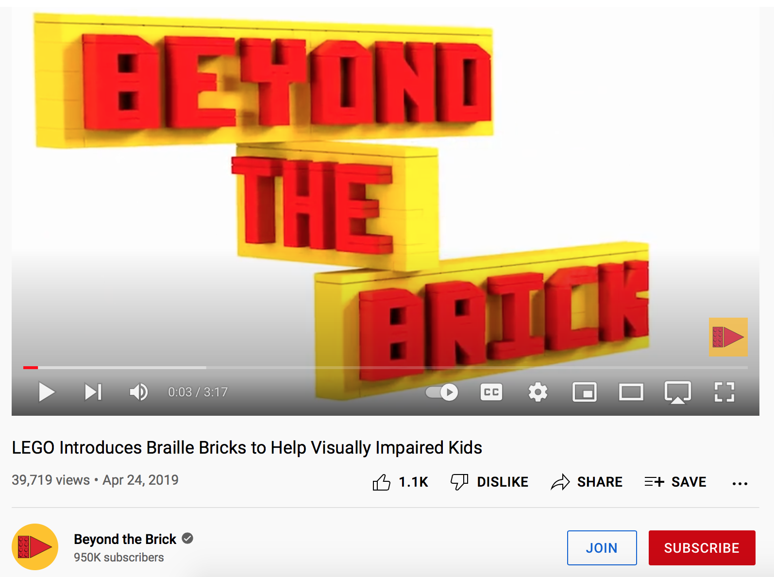
One fantastic example of innovation, inclusivity, ideation, and problem-solving is the brilliant initiative by LEGO to make Braille Bricks help visually-impaired children engage in advanced learning. The entire marketing behind the braille bricks is garnered around problem-solving, learning (in different languages), mathematics, problem-solving, skills development, and vocabulary through LEGO Braille Bricks. By introducing a new product, but marketing it as a solution to a new method of learning, has increased the brand standing, helped teach a brand new way of learning, and solved the alphabetical issues that young visually-impaired learners were having.
Images that appeal to the audience and help find solutions instantly become shareable and go viral on Instagram, Facebook, WhatsApp, and other social media platforms.
3. Relevance
Choosing relevant images and graphics is the best thing marketers can do to attract the target audience’s attention. Since the brain processes visual imagery faster than text, it is critical to ensure a high relevance factor in all the images on Instagram posts, stories, and reels. If the Instagram page pictures do not fit the brand image, status, key highlights, or niche, audiences might be driven away from the page.
Standout images are striking, but they may not be shareable. Shareable images are relevant to the audiences and the brand. For example, the account of AmericanAir is less about the text and colour and more about emotional relevance through its people and social initiatives.
4. Font
Choosing the right font is to social media what body language is to communication. The typeface you choose can greatly influence the readability of your post. Icon fonts allow you to create your own special font, which can be used in conjunction with your chosen brand’s political beliefs and how long a reader will stay on a given article.
Marketers need to think about the content before factoring in the font. It is necessary to decide on the emotional aspect of the text and how the font will make an impact. To make a final decision, marketers should try different fonts that make a difference and try them with the same design. It is best to choose the most legible, readable font for all audiences to avoid an issue with legibility. It is also ideal to use the font that holds the most sway with audiences instead of a personal favourite.
5. Consistency Is Key
Shareable social media images do not become viral overnight (usually!) They need time to get traction and become engaging. When creating shareable photos, marketers must remain consistent with the brand values, images, colour palettes, and tone of voice. Fast action and consistency are vital to ensuring the brand becomes memorable. A straightforward example of consistency is sticking to a timetable and posting an image simultaneously each week for a month.
Viewers will get used to regularly receiving content. Doing this will also generate anticipation, create interest, and keep audiences intrigued. Many social media marketers prefer using easy-to-read and understanding taglines to help with the image. Things like ‘Have you tried it yet? Who has tried it?’ or other questions that engage with viewers help drive interest and curiosity. Asking audiences to make choices and following up with the majority also helps drive engagement and sharing.
As the posts become popular, the shareability of the posts skyrockets to become viral trends.
6. Create Original Content
While it is necessary to share content, it is also critical for marketers to create original content for target audiences. New posts stand out and get audience attention much quicker than constantly shared material. Creating a branded background template and using it as a backdrop for each social media creative helps get the audience’s attention and makes the post shareable. Audiences also interact with creatives that are standardized and familiar.
Reusable templates help save the brand plenty of money, add familiarity to all posts, and show digital content uniformity. It is also best to include a logo and watermark on each creative to reinforce familiarity with the brand.
7. Optimize Branding, Size, and Text
Optimizing all posts is key to making images shareable. Images that are not optimized according to brand, size, and source will not get enough traction with little chance of being noticed. Instagram has strict guidelines about the dimensions of images. Ensuring all the content is viewable in the picture with the brand and source is key to getting more eyeballs. For Instagram posts, square-ratio images work best. These images can also be used on Facebook. However, the image ratios keep changing on Instagram stories and videos.
It is necessary to use the correct colour palette, image size, ratios, and source for each creative content. While optimizing the image, marketers should also remember to use the right font and font with relevant hashtags, layouts, photos, and quotes. The account ThisGirlCan got more than 62,000 followers within a year by promoting images of real women with motivational fonts, texts, and hashtags to create awareness about women in sports.
8. Call To Action
There is high competition in the digital marketing space, and marketers need to ensure that each image, post, and piece of content has a prominent Call To Action (CTA). Depending on the marketing goals, increasing likes, shares, comments, clicks, and sharing is necessary. The CTA needs to be on the image, tastefully done, and extremely obvious. It should also address what you want the audience to do in the least words.
Marketers need to add immediate context to the CTA without making it sound forceful.
Some good examples of CTA are:
- 20 Hot Summer Finds
- Free Marketing Seminar. Sign Up Below
- 3 Tips for Fast Launches
- Visit www.xyzabc.com for the full story
On Instagram, marketers cannot add URLs to the images, so there needs to be a strong CTA for viewers to click the link in the bio. The Instagram profile link has to link to the website or marketing page (for the CTA).
While making shareable Social media images is necessary, it is not only the picture that can help with higher conversions. Marketers can also use fonts, font sizes, and text.
Font Generators – How Can They Help?
Font generators are the easiest ways to add unique customized fonts to all Instagram content. Marketers use these fonts to generate interest and to attract viewer attention. They can use several free and paid tools to build a database of different fonts. All they need to do is enter the text, pick a customized font, copy the newly converted text, and paste the entire content into the Instagram caption (for posts), bio (on the profile info page), Instagram Stories (for reels), or IGTV descriptions.
We have a small list of some free Instagram fonts that marketers can use:
- IGFonts.io: Marketers have the option of copy-pasting the newly formed font directly into the Instagram Bio. This font maker is also excellent for creating bio symbols.
- LingoJam: LingoJam is straightforward to use. Simply type the text in the left box, and several fonts will appear on the right. Marketers can also make a new font with the easy-to-use font designer.
- CoolFont.org: CoolFont is also like LingoJam without the design tool. However, they have more than enough varieties of fonts to select from.
Best Practices for Using Custom Instagram Fonts
Custom Instagram fonts are excellent at getting attention. However, these fantastic and unique fonts can do more harm than good to the brand image and reputation if not used wisely. While using custom fonts, it is also necessary to keep accessibility and alt text (alternative text) in mind since some viewers may have difficulty reading the customized font.
Aesthetic
Different fonts have different meanings. When choosing a font, aesthetic, overall appeal, look and feel, and the impression matter greatly. Some examples of font meanings are:
- Normal – self-aware, stable, deliberate, a stylistic choice
- Fancy Cursive – particular, curated, aware
- Typewriter – macro or micro-content, quotes from famous personalities
- Bro – young, trendy, sporty
- Comic Sans Adjacent – energetic, urgent, hyperactive
- The Cut – questioning, curious (also used for polls and questions on Instagram stories)
- Android – quiet, thoughtful personality, kind, mediating
Use it Sparingly
Too many times, using a customized font can cause chaos, look spammy, and could lessen the message or the impact of what is being said. Marketers should exercise control when using these fonts and instead use them to highlight key facts, calls to action, headers, and emphasis. Clothing brand H&M uses their customized fonts sparingly to bring critical attributes to the viewer’s attention. Doing this helps them get key points across to their readers faster.
Legibility
Many times customized fonts are pretty challenging to read. Marketers should avoid using illegible fonts since most viewers might associate the brand with confusion. It is crucial to ensure that all readers can view the fonts clearly without any misunderstandings or difficulties. A great example of legibility is the Tim Hortons Instagram page, which uses customized fonts, but keeps them legible, engaging, and relatable.
Consistency
As a marketer, consistency shouldn’t only be about social media posting schedules. It should also be about the consistency of the scheduled posts. Being consistent with the chosen font to create an identity and recognition in the minds of audiences is critical in the brand establishment. Consistency in fonts, colours, text sizes, and backgrounds will help strengthen the brand and increase the following. For example, what started as an account for dog lovers – We Rate Dogs, has emerged as a brand across social media channels, including Instagram. This is because of the consistency of their posts, customized fonts, colours, and content.
Which Font is Trending on Instagram Currently? The Papyrus Font!
Marketers need to keep on top of their game with Instagram fonts. The most trending one right now is the famous hidden Papyrus font.
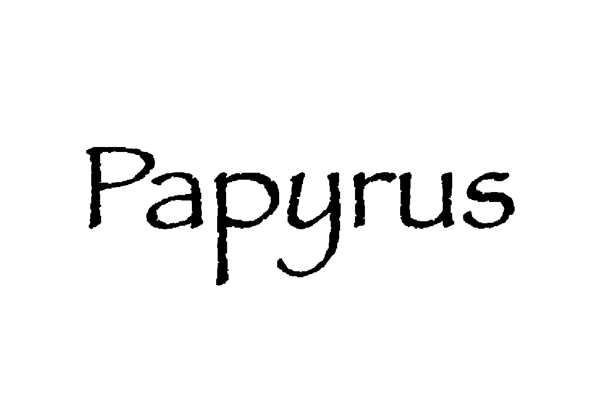
The hidden papyrus font is taking the Instagram world by storm. This font is a hidden feature (like the papyrus font on Microsoft Word) in Instagram Stories. It is pretty easy to use this typeface in Stories. While Papyrus is not considered a particularly loved font (just like Comic Sans), it is famous because it is hidden. The papyrus typeface easter egg is available on iOS with the Instagram application.
Let us see how marketers can use it to gain followers simply by activating it.
- Open up the Instagram account, and upload/ record/ or click an image.
- Tap the text button – the one at the top (Aa)
- Scroll to the Comic Sans font (Aa) and type the term ‘ Papyrus.’
- Once done, type enter, and delete the word.
- Marketers can triumphantly type all the text in Papyrus typeface.
Marketers that add customized fonts to creative stories, reels, IGTV, and posts on Instagram help the brand gain target audiences. Adding custom fonts to the Instagram strategy can strengthen the brand voice and personality and gain constant audience attention.
Ready to scale your agency growth? Skyrocket your online presence and foster credible relationships with businesses on Agency Vista.